
TL;DR

Turn quiet afternoons into listening time
- Thousands of audiobooks, podcasts and originals
- Listen on your phone, tablet or Echo — also offline
- Cancel anytime
Vision-friendly home labels work best when they use clear, high-contrast words, appear in predictable places, and remain readable in the room’s usual light. Start with a few frequently used or safety-critical items, ask the person what helps, and test labels in place; use tactile or audio cues when print alone does not work. Keep medicines in their original packaging and ask a pharmacist about accessible instructions.
The pantry can look perfectly orderly and still hide the tea from the person reaching for it. A label that seems clear in bright daylight may blur under a warm kitchen bulb, and a red sticker may mean nothing to someone who cannot distinguish that color from its background.
Simple vision-friendly labeling around the house helps you make everyday items easier to identify for people with low vision, aging eyes, color-vision differences, or anyone working in dim light. The goal is not to label every object. It is to make the things someone uses often easier to find, while keeping the home’s familiar rhythm and the person’s independence.
You’ll learn how to choose readable words and contrast, where labels work best, how to add tactile or audio cues, and how to handle medicines safely. You can begin with one shelf and a few sample labels. Then let the person who uses them tell you what feels clear.
Test label samples at the person’s usual viewing distance and in the room’s normal light; there is no single font size or color choice for everyone.
Use short, plain words with strong contrast, and put labels in the same place on similar containers.
Treat color, tactile markers, and phone audio as extra cues; keep a written identifier when it is useful.
Start with frequently used or safety-critical areas, then expand only after the first labels work well.
Keep medicine packaging and instructions intact, and ask a pharmacist about accessible directions.
Home accessibility / practical guide
Simple Vision-Friendly Labeling Around the House
Make everyday items easier to find with clear words, strong contrast, and familiar placement. Begin with a few useful labels, test them in the room’s usual light, and let the person using them shape the system.
There is no one-size-fits-all label. Test it at the distance and lighting where it will be used.
01 / Build a readable label
Words first. Contrast always.
Low vision varies from person to person. The right lettering and colors depend on the reader, the viewing distance, and the room.
Keep words plain
Use familiar sans-serif lettering, generous spacing, and a few direct words. Label makers and careful handwriting can both work.
TEA · RICE · BATTERIESMake the words stand out
Try dark text on a light background or light text on a dark background. Avoid patterns, glare, and colors that blend together.
BLACK ON WHITE / REVERSEMatch the room
Use wipeable labels near sinks and fade-resistant lettering in sunlight. Check readability again after cleaning and regular handling.
WIPE · CHECK · REPLACE02 / Test before scaling
Try a sample in its real setting
Bright daylight can make a label look clear; a warm bulb, shadow, or glossy surface may change what the reader sees.
Put “flour” where the flour lives.
Ask the person to read it from their usual seated or standing position. Check it in morning light and again under the kitchen’s evening bulb. Let them choose the version that feels clearest.
03 / Add a reliable cue
Use more than one way to find it
Color, touch, and audio can add helpful clues. Keep written words when they help identify the item.
Color: A blue dot may group towels, but the word “towels” still identifies what belongs in the basket. Color can look different in different lighting.
Touch or sound: Try one distinct raised marker or a phone’s text-to-speech with the intended user. Check that the cue feels comfortable and is easy to use.
04 / Place labels where routines happen
Make the home layout do some of the work
Labels work best when items stay in familiar places, words face the person, and nothing blocks the view or reach.
Front-facing pantry
Put words on the front edge of baskets and keep frequently used tea, sugar, and mugs in their usual spots.
Simple, wipeable cues
Mark baskets or shelves such as “soap” and “towels.” Choose surfaces that stay legible after wiping and handling.
Easy-to-find essentials
Clearly identify cleaning supplies, appliance controls, and emergency items. Keep pathways clear and words unobstructed.
A simple sequence
Start small, then follow what works
A short in-place trial shows whether a label is useful before you change the whole home.
Choose a routine
Pick one shelf or a frequently used area.
Make a few samples
Use short words and clear contrast.
Test in place
Check distance, lighting, and comfort.
Keep or adjust
Expand only after the first labels work.
Safety note / medicines
Keep medicine directions intact
Medicine identification needs clear, dependable instructions. Never guess a medicine from how a pill looks.
Keep original packaging and instructions.
Avoid covering dosage details or warnings with a new label. If ordinary large print is not enough, ask a pharmacist about accessible directions or vision-rehabilitation services.
Choose contrast and lettering you can read where you use the item
Vision-friendly labels are short, clear identifiers printed or written so the intended reader can see them at the distance where they reach for an item. Start with familiar sans-serif lettering, generous spacing, and strong contrast, such as black on white or white on a dark background. The best combination depends on the person’s vision and the room’s light.
A label maker can create consistent lettering, while careful handwriting may let you make a word larger or use a familiar style. Either can work. Keep the wording plain: “tea,” “rice,” or “spare batteries” is often easier to scan than a full description. Think of a label as a road sign; a few large, familiar words help you find the right turn faster than a paragraph.
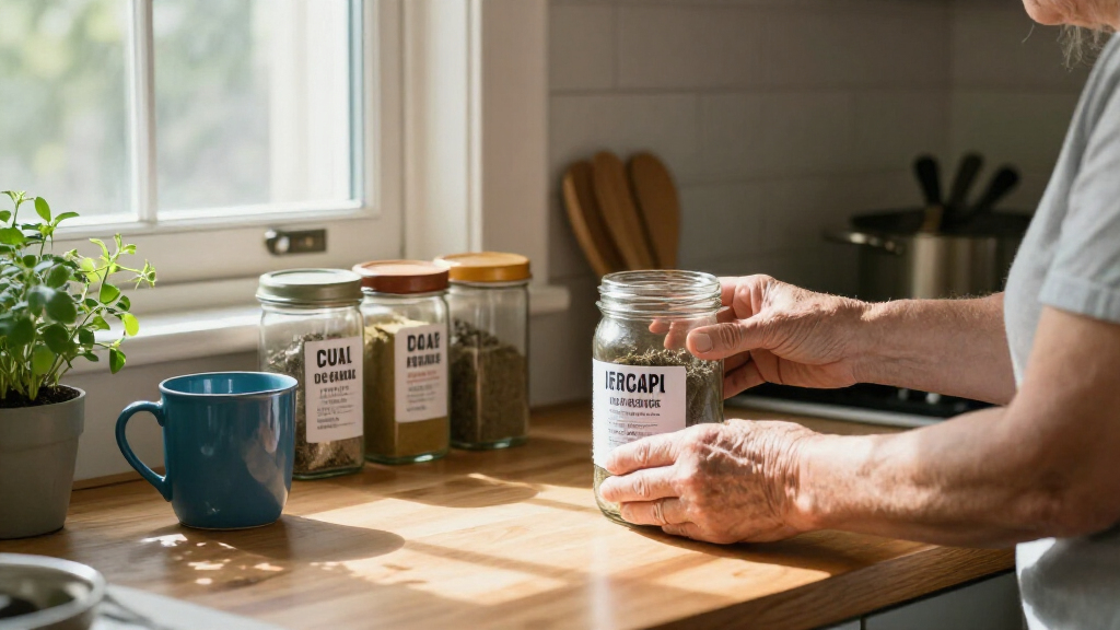
For instance, place a sample label on the front of a flour canister and ask the person to read it from their usual standing or seated position. Check it in morning light and again under the kitchen’s evening bulb. Glare, shadows, glossy surfaces, patterned containers, and small print can all change how readable it feels. There is no universal font size or color scheme that works for everyone.
Try two or three versions before labeling a whole cupboard. One person may prefer dark letters on a pale background; another may find light letters on a dark background easier. Let the person who will use the label choose when possible. That small choice supports both comfort and independence.
Products Worth Considering

Philips Hue Large Smart Light Tube, Black – White and Color Ambiance LED Color-Changing Light – 1 Pack

Dyson V8 Cyclone Cordless Vacuum

Ring Outdoor Cam 4K Plus Battery Security Camera, 3-Pack, White
As an affiliate, we earn on qualifying purchases.
Make labels easier to find with predictable placement
Consistent placement makes household labels easier to scan because you learn where to look before you read the words. Choose a repeatable spot: the front of every shelf bin, the lid’s upper-left corner, or the same place on each drawer. A predictable layout works like a familiar route through the house; you can find your destination without searching every surface.
For instance, put labels on the front edge of pantry baskets instead of on their tops. Someone who cannot easily lean over a shelf can then read the word while facing the cupboard. In a hallway, label the front of a basket “hats” and another “gloves,” using the same height and corner for both. Keep the system simple enough that a family member can return an item to its usual place.
Short labels help, but the layout around them matters too. If the “tea” basket moves between shelves each week, its label has to do all the work. A tidy, steady home arrangement gives the label a useful partner. Put frequently used items within comfortable reach, keep pathways clear, and avoid stacking other objects in front of the words.
Ask the person who uses the space whether the placement feels natural. A label that looks neat to a caregiver may sit too high, too low, or on the wrong side for someone else. A quick trial with a few containers can reveal that before you label the whole pantry.
Use color, texture, and sound as extra clues
Color, touch, and audio can support a written label, especially when print alone is difficult to read. Color coding may help group similar items, such as blue for laundry supplies or yellow for craft materials, but the word still needs to identify what is inside. Colors can blend together for some people, and lighting can change how they appear.
For instance, a blue dot on a “towels” basket may help a family sort laundry, but the large word “towels” still tells a guest or caregiver what belongs there. Friendly labels make everyday items easier to identify for people with low vision, and written words give the system a clear signal even when someone does not distinguish the color.
Raised lettering or textured markers can offer another clue. A small, distinct bump on the same corner of each appliance control might help someone locate a familiar setting by touch. But textures should be easy to tell apart and placed consistently. Some people find raised marks uncomfortable or hard to distinguish, so ask before adding them and test just one or two.
A phone’s text-to-speech or magnification feature can also help read a small printed label. Some accessible labeling devices let you record spoken descriptions. Try any app or device with the intended user first; the phone needs to be charged, accessible, and usable in that setting. A spoken note can help identify a storage box, but it does not replace clear physical organization for quick daily tasks.
Start with the kitchen, bathroom, and other high-use spots
Start labeling where a clear cue saves repeated searching: frequently used shelves, drawers, bathroom supplies, appliance controls, and emergency items. You do not need a label on every object. A few carefully placed words can make a busy morning feel less like a scavenger hunt.
Imagine a caregiver helping someone prepare tea. Labels on the tea, sugar, and mugs can make the routine easier to follow, especially if each container sits in its usual place. In the bathroom, a large “soap” label on a basket and “towels” on the shelf can separate similar-looking items. Near the front door, a clearly marked emergency-supplies box can help a household member or visitor find it quickly.
Use materials suited to each spot. Kitchen and bathroom labels may need to withstand splashes, wiping, or frequent handling, while a sunny windowsill can fade some lettering over time. Wipeable or laminated surfaces may suit damp areas; check that the words remain readable after cleaning. A label that peels at the corner or fades to pale gray is harder to trust.
Keep the surface behind the label calm. Text over a floral pattern, a shiny reflection, or a crowded row of jars can be tough to pick out. If the container itself is patterned, attach a plain label with a solid background. Clear the shelf enough to see and reach the item without moving several objects first.
Identify medicines safely without changing their instructions
Medicine labels need clear access to the original name, dose, and warnings, so keep the pharmacy packaging and instructions intact. Do not guess what a pill is from its color or shape, and do not cover information with a large-print sticker. If ordinary print is difficult to read, ask a pharmacist about large-print or other accessible instructions.
For example, a person may keep several prescriptions on a kitchen counter and find the small pharmacy text hard to read. A large, separate location label on the storage basket could say “morning medicines,” while each medicine remains in its original labeled package. If a pill organizer suits the person’s medicines and routine, ask a pharmacist how to use it safely; some medicines may need special storage or handling.
A simple routine can help you make the area more usable:
- Keep each medicine in its original packaging, with its pharmacy label and warnings visible.
- Ask the pharmacist about accessible instructions, such as large print or another format the person can use.
- Use separate organization cues, such as a labeled basket or a consistent storage location, without guessing at a medicine’s identity.
- Check the setup with the person so the labels and routine make sense to them.
This approach keeps identification tied to reliable instructions. If the person is unsure which medicine to take or how to read a direction, pause and contact a pharmacist or other qualified professional rather than relying on a homemade label.
Test a small set of labels before changing the whole home
A short in-place trial shows whether a label really works before you invest time labeling every drawer. Ask the person what they want to find more easily, choose a few useful items, and test the wording, contrast, size, placement, and material in the actual room. A label that looks crisp at the table may be hard to read from the armchair or under a dim hallway light.
For instance, try three versions on one pantry bin: black on white, white on black, and a larger handwritten word. Stand or sit where the person normally reaches from, and ask which version they can read without leaning or guessing. If they prefer a textured marker as well, add one in the same location you plan to use elsewhere.
Check the labels during ordinary routines, not only in a quiet test. Can the person identify the right tea while holding a mug? Does the bathroom label stay clear after the sink area gets damp? If someone uses a phone to read text aloud, is it charged and easy to operate when needed? These small details help you decide which tools belong in that home.
Review the setup after a few days. Replace words that are too long, move labels that get blocked, and remove cues that confuse the person. The point is to support their habits, not make the house feel like a warehouse. A system that matches the reader’s preferences is more likely to be used and kept up.
Keep labels useful as light, routines, and needs change
Check labels periodically so they stay readable and accurate. Wipeable labels can still collect grime, adhesive corners can lift, and sunlit lettering can fade. A quick check while cleaning or putting groceries away helps you catch a label that no longer does its job.
For instance, a “tea” label may remain clear while a nearby “coffee” label fades from the afternoon sun. Replace the worn label with the same wording, contrast, and placement so the familiar pattern stays intact. If the household changes a cupboard arrangement, update its labels at the same time instead of expecting the person to remember a new location without a cue.
Vision is not one uniform experience. People can differ in how sharply they see, how much of a scene they notice at once, how easily they distinguish contrast, and how they respond to glare. Those differences are why a label that works well for one family member may not work for another. Ask the person directly and treat their feedback as the best guide to the setup.
Lighting and clear storage matter alongside the label. A brighter, even light may make a word easier to see, while a reflective surface can create glare. If a person’s vision or ability to manage daily tasks changes, a qualified vision professional or rehabilitation service can offer tailored guidance. A few ordinary adjustments—a clear shelf, a steady label spot, and a comfortable light—can make familiar routines feel easier to manage.
Frequently Asked Questions
What font size should I use for household labels?
There is no single size that suits everyone. Print a sample and check whether the person can read it comfortably from the usual viewing distance, in the room’s normal lighting. If they need to lean close or guess, try larger lettering or a different contrast.
Which label colors work best?
Strong contrast matters more than a particular color. Black on white is a useful starting point, while some people prefer light lettering on a dark background. Avoid placing words over patterns, and do not rely on color alone to identify an item.
Should I use a label maker or write labels by hand?
Either method can work if the result is clear and durable. A label maker gives you consistent lettering; handwriting may let you make a word larger or more personal. Test a sample on the actual container before labeling a whole shelf.
Are tactile labels better than large print?
They are another option, not a universal replacement. Some people find raised letters or textured markers useful, while others have trouble distinguishing them by touch. Ask the person, test a small number, and place any markers consistently.
How can I label medicine safely?
Keep each medicine in its original packaging and leave its pharmacy instructions and warnings visible. Ask the pharmacist about large-print or other accessible directions if the current print is hard to read. Do not identify medicines by appearance or cover dosage details with a homemade label.
Do phone apps replace physical labels?
Phone magnification and text-to-speech can help someone read small print, and some labeling tools can play recorded descriptions. They depend on an accessible, charged device and may not suit every task. Physical labels and orderly storage remain useful for quick identification around the home.
Conclusion
Begin with a few items the person reaches for every day. Use clear words, place them consistently, and test them in the light where they will be read. Keep medicine instructions visible and ask a pharmacist when print is not enough.
A good label is a small signpost in a familiar home: easy to find, easy to read, and there when you need it.